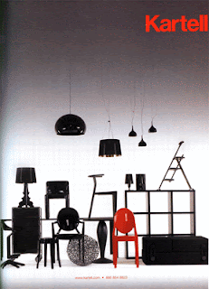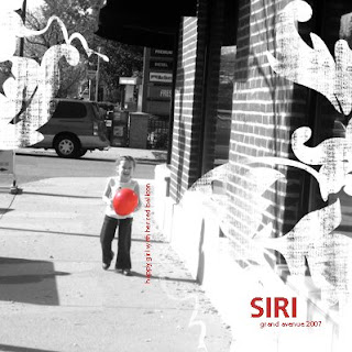

I decided to keep it simple and just focus on a few things from the ad. I chose to focus on color and some of the simple bold text. I love this ad because I think it is really versatile. I like the idea of doing a lot of little photos down at the bottom to mimic the layout or just doing a sepia tone layout with one color popping. Check out the gallery to see the rules and prize for this challenge!
