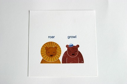
So my question is, Why are people afraid of empty space? I have heard some of the following remarks: it’s boring, it doesn’t look like much time was spent on it, it’s too simple, or it makes it more interesting if it is all covered up.
It’s interesting that these are some of the reasons why “empty space” is a problem. First of all, empty space, or negative space or white space, as a designer would call it, is really important all on its own. Negative space allows us to focus in on what is important and to draw contrast between the foreground and background. The important thing is to make good use of your negative space.
What do I mean by this? I mean, make your “empty space” count. Make it important. You do this by really creating an interesting shape with your background or doing things in the design that makes the foreground that much more important.
I think the use of negative space and this question of “use of empty space” brings up the question of what a designer’s responsibilities are. Is our only job to to make things look pretty? I hope not. When I first got into design I felt like it was the perfect marriage between marketing and art. As far as I’m concerned, designers are organizers. We take visual information and organize it in a way that it is easy to understand visually. That’s why negative space is so important. We need it to help organize the different elements that need to co-exist and give accurate information.
One way to do this is to simplify your designs. Probably the most famous example of a designer who decided to simplify his design is Lucian Bernhard. This German designer entered a competition for Priester matches and started out with a design with multiple layers of information and imagery. He stripped away everything until all he had left was the brand name and image of the product.

He won the competition because the poster clearly showed off the product and brand name. As a designer, that’s our job. To create focal point, the area where the eye rests or concentrates, that is strong and lets the audience know right away what the message is.
Here are a few examples negative space used well. Look at them and think very carefully about what your eyes is drawn to. Is there a logically way that you automatically look at this? Are you reading it left to right? Top to bottom? Or does the designer push you another way.
Saul Bass (famous for his movie poster)
Milton Glaser’s Bob Dylan Poster

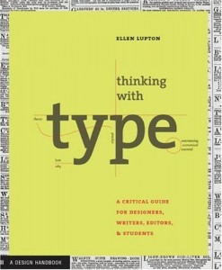
Ellen Lupton’s Thinking with Type Cover
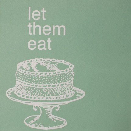
BluLima’s Let Them Eat Cake Screenprint Poster
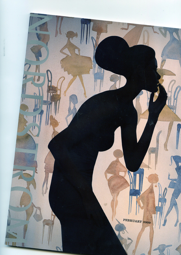
These are just a few examples to get you thinking about negative space. One thing to be aware of is that negative space doesn’t have to be completely solid…it can be a pattern, texture…as long as it acts as the background. I just got a Nordstroms catalog in the mail that does this very thing. Lots of little watercolored silhouettes make up the background and add interest to the cover without taking away from the foreground image.
Here’s an article that explains how to use negative space in your artwork. They show some truly minimalist work where negative space is the main event. Check out the image with the -1. See how the use of texture still acts as negative space? Visit Tutorial 9.
Resources that you should check out!
Here’s a short article from a web designer who has a similar perspective on use of negative space. I like his short story and advice. Check out MyIntervals.
[ad]

