Okay, so here’s the before:
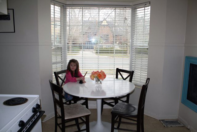 So this is my kitchen. Very big, I know.
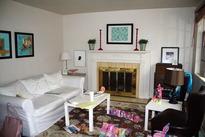 My Living Room…there was a pony parade going on!
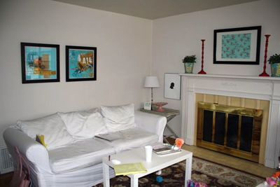
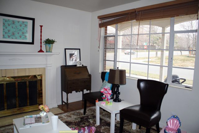
Here are the colors I chose:
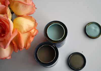
I actually tried out the taupe and knew it was just right…but the tiffany was a little dark for my taste. My finally color ended up being the shade lighter than this color, which wasn’t exactly right, but will do for now. It needs just a hint of green.
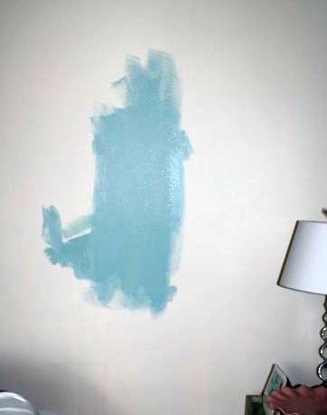
This is the shade darker…glad I tried it before buying the gallon! And the final results! TA DA! Ummm, I love color! It changes the entire space…notice I haven’t changed a lot else (I DID pick up the ponies, but they’ll be back!:)
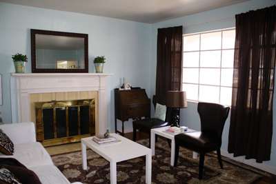
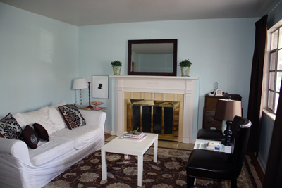
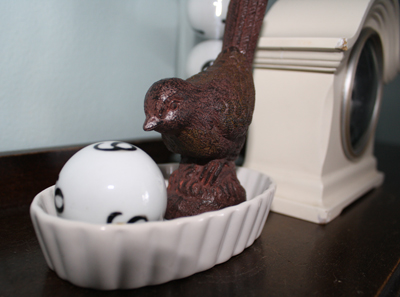
Darling little bird and number balls found at Thai Pan Trading! $2 for the bird and $1.50 for the balls!
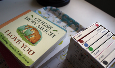 I once saw this on a show…the kids books stayed in the room on a tray. Heaven knows that our kid books are ALWAYS in this room, so it seemed right to sort of “organize” them by putting them on a tray.
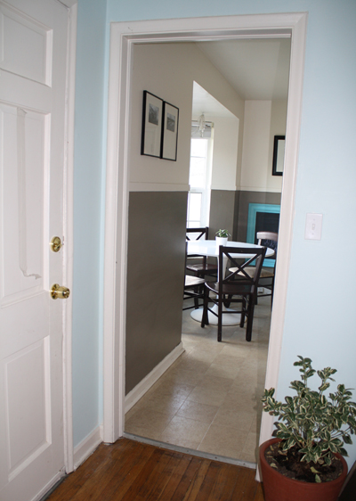
I only painted the bottom half of the kitchen taupe. High contrast heaven!
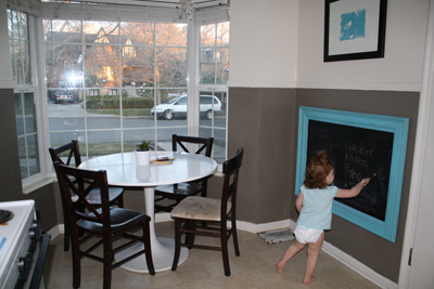
I’ve already have a dozen more projects for all these rooms. I have curtains…but I’m not sure if we are going to be able to hang them in here because of the plaster in the wall…it makes it hard to drill!
MY FRAME PROJECT—Painting the frame, take 2
Okay, back to the living room…notice that great focal point frame (and nothing else on the wall? hehee…)? I found that at Home Goods on clearance and painted it. ‘Painted it’ is an understatement because I actually worked on it THREE times because I could get the color right. I thought I wanted it to be white. It didn’t work. I mean, NOT AT ALL. It looked terrible (By the way, that frame WILL get hung…just haven’t gotten round to it yet). Then, I decided to be bold and paint it red.Also a bad idea…but not as bad as the white. The THIRD time I painted it brown, but left some of the red peeping through (just a tiny bit). It was exactly what I needed. I want it to be a focal point and it had to compete with the curtains.
Here’s how the frame started out. Gold, ugh, not for me. I love how ornate it is though!
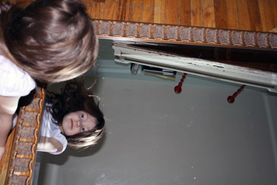
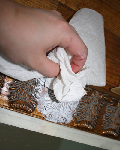 Here’s the white phase, which leads very nicely into the red and brown phases.
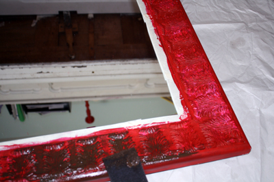 While the red phase looks COMPLETELY scary here, I’m glad I did it because it acts as an undertone for the brown and gives it dimension. It’s not FLAT.
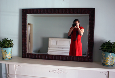
The final un-hung frame. I’ve been a busy gir1. I’m about to fall asleep writing this! I’m off to bed early tonight! And remember to check tomorrow! I have an interview with Holly Jones and a great giveaway from her super darling store My Cute Stamps!
[ad]
