If you love analyzing design as much as I do, this Amsterdam design review is for you! One of the best ways to understand what makes a design great—or not so great—is to study the design around us. That’s exactly what I did on my recent trip to Amsterdam, and I share all of it in my newest YouTube video, Sweet Life of A Designer Amsterdam Design Review. You can watch it here: https://youtu.be/k6kw10PTTeA.
Throughout my Amsterdam design review, I dive into everything from hotel interiors to typography on city streets. If you’re a designer, creative, or just someone who loves beautiful spaces, this video is a must-watch.

The Stunning Design of Hotel Nobleman
First, I review the incredible design at Hotel Nobleman, where I stayed during my trip. I absolutely loved the dark, moody walls that created an elegant yet cozy atmosphere. The light fixtures throughout the hotel added so much character — each one was unique and perfectly placed.
Even my hotel door became a subject of analysis! It featured a gorgeous metal ornamentation with beautiful typography that blended classic design with modern touches. As part of my Amsterdam design review, I couldn’t help but stop to appreciate how well the hotel combined intricate details with a modern vibe.

Unique Design Elements That Stood Out
As I explored more of the hotel, I spotted light fixtures shaped like guns — something you don’t see every day! They brought an unexpected edge to the elegant surroundings. In addition, the copper tub in my room was a stunning focal point. Of course, I also analyzed the artwork throughout the hotel, which ranged from bold to minimal but always interesting.
Restaurant Design that Inspired
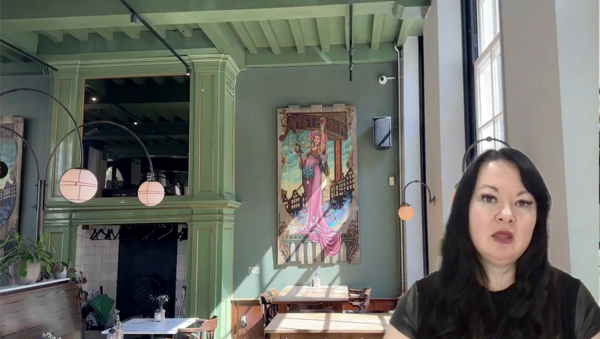
Another highlight from my Amsterdam design review was a visit to Nieuw Amsterdam, a restaurant I enjoyed with my friends Nicki and Natali. The space had an Art Nouveau feel, with rich green walls, hanging lamps, and vertical artwork that created a sense of height and movement in the space. Every detail felt intentional, and the whole environment made for an amazing dining experience.

Typography All Over the City
I couldn’t do an Amsterdam design review without talking about typography! Walking around the city, I was constantly inspired by the fonts used on signage and buildings. Most of the city embraced Sans Serif fonts, giving everything a modern and clean look. But every now and then, I found Serif fonts and even script fonts, which added flair and elegance.

Final Thoughts on Amsterdam Design
Overall, Amsterdam offered a modern design experience filled with thoughtful details, amazing typography, and creative interior spaces. As a designer, I couldn’t get enough of it! If you’re looking for inspiration or just want to enjoy some great design eye candy, you can see all my favorite finds in the full video here: https://youtu.be/k6kw10PTTeA.
